Sunday 16 December 2012


In this magazine advert of Rihanna she is represented as carefree but also feisty. I say this because she is hardly wearing any clothing, infact she has a piece of clothing against her body, which indicates that she is untroubled. However the main colour around the whole image is Red who implies fire and bravery. Rihanna is known for her wild outgoing lifestyle and is highly represented in this magazine advert.
The design and layout of this advert is very bold and Loud. This is very common for and R&B/Pop artist. In the media Rihanna is not seen as one to hold back and also stands out from the crowd therefore the layout of this advert represents her in a major way because it stands out from dull colours.
The advert is laid similar to the Digipak in terms of colour and front. However there is one thing that this advert doesn’t have that others do, and that is the front of the Digipak somewhere in the connors to promote the album. This reason for this again may link to Rihanna being different from many people and breaking the rule. The advert gives you information about when the album is being released.
Automatically looking at the advert it is obvious that rihanna is a Pop artist. I say this because the genre ‘pop’ is known for loud outgoing extravagant colours and this is exactly what is portrayed in this advert although its only one colour it has a massive impact on the whole advert.
Although this advert does not have the front cover of Rihanna Digipak it still represents the album because the same colours used in the album are used in the advert, which is a massive link.

Monday 2 April 2012

Question 4


How did you use media technologies in the construction and research, planning and evaluation stages?
Second dratf
Blogging
I used the blog as an online diary detailing every step of the planning and construction. I used it to post primary research findings including audience survey results and analysis of existing products. This was useful because I could receive feedback on my work and update it instantly. As I was working in a group it was also useful because I could see my partner’s blog which made it easy to communicate and correspond with each other. Also using a blog allowed me to keep my work organised and structured in a way that my teacher and my partner could understand and appreciate.
Search engines
Search engines such as Google, YouTube, Facebook and survey monkey were a big help to my planning and research. This is because they allowed me to gain information that eventually enabled me to make my end product which was my music video. For example YouTube allowed me to compare different genre music video and helped me choose which kind of genre I would be interested in making a video of.  Survey monkey was another contribution to my planning and research because it enable me to create questionnaires online and email them to others which is a major change compared to a couple years ago were the only way you would be able to create a survey is if it was hand written. When I finally finished my music video I uploaded it on Facebook for prosumers to comment and tell me what their opinion of the video is. This was useful because it allowed me to get a range of opinions on my video and i also got an insight as to who my target audience was.
Camera
In order to start the planning of our video we created a mood board with all our ideas put into one, we then had to showcase this onto our blogs in which we took a picture of the mood board using the Nikon coolpix and uploaded it on our blogs. For our actual music video we decided to film it with the Nikon SLR however we decided to change this half way through our film n because we realised that the Nikon SLR is more useful for taking pictures and not videoing, this is why we switched over to the Sony HD camera which was much more easier to use and film with.  The Nikon SLR however did come in handy when I was taking the pictures for my ancillary product. The camera allowed me to manipulate the pictures i took by giving it different effects such as blurry also the flash made it look like I had taken the pictures in the dark when in actual reality some of the photos were taken in day light.
Final cut
In the planning stages I and my partner created an anamtic story board of how we wanted our film to look. When uploading it on the Mac we decided to use the software called imovie. The reason why we choose to use this was because it was much easier to use and to get to grips with, although it didn’t have many effects this did not really matter because it was only for the planning and not the real thing. However when it came to the real music video we uploaded it and created it in another software called final cut. At first I and my partner found final cut difficult to use as we had nevere actually used it before, as time went by we got the hang of it and realised it was a much better software to use than imovie as it had effects such as light rays, colour contrast, and colour saturation. There were times were final cut was difficult to use especially when our work disappeared on the timeline but we overcame this technical problem.
Photoshop
After taking the photos for my ancillary product I used Photoshop to manipulate the pictures. I done this by experimenting and changing the colour of the picture by using colour filters which were red, blue and green, i played around with these colours up till I found the perfect colour for my picture. Also i made the background slightly blurry and dark whist at the same time my artist stood out. The black and white effect on Photoshop was another thing that I mange to manipulate with, this effect was used in my back cover of my album.


Thursday 9 February 2012

Link to my survey (Question 3)

This is a link to my music video please click on it to preview the music video then click on the survey, Thank you :)
http://www.youtube.com/watch?v=A7Wx5T6II5U


This is the link to my survey.
http://www.surveymonkey.com/s/NFGVNQG

Question to Survey (question 3)

These are the survey questions I came up with for my audience research.


Wednesday 8 February 2012

Question 2- 2nd draft of evaulation


How effective is the combination of your main product and ancillary texts?

There are some difference with my main product and my ancillary text; however there are also some similarities between the both. The location of my media product is in a forest and this is the same place I decided to do my photo shot for my ancillary text. The reason begin is that I wanted my digipak to have the same effective background that my media product does and also majority of the artist songs are very unusual and different, this is why I believed that a forest would be the perfect location as it is an unsual place to be on a normal day.
In our main product our artist wore a white top which symbolised purity however when arranging my photo shoot I requested for my artist to wear a black top because I wanted her to look mature and older and I also wanted to show another side to my artist which is down to earth. However although I changed the top the main thing I made sure I kept was the jean shorts. I decided to keep this item because in my main product the short are shown often and have now become part of the star iconography as she’s wearing it in all of my photos. For example over the last couple months Beyonce has been seen wearing leotards in many of her music videos, the fact that she has persisted to wear this often, has now made it  part of her star image and this is exactly why I wanted to keep the jean shorts, so that my artist could be identified with something.
The way in which I represented my artist make-up and hair in my ancillary text compared to my main product is completely different. In my main product her hair is down and has this messy’I don’t care’ look to it which show that my artist is different and isn’t scared of being unique and akward. However in my ancillary text my artist look well put together because her hair is up in a bun although again it’s a little bit messy it shows that she is versatile and also that she isn’t perfect. Her make-up in the main product is very heavy, the fiery red lipstick and the dark black and gold eye shadow implies that she is outgoing and isn’t afraid of looking ‘over the top’. This could get two reactions from the audience; they could love the fact that she’s different and isn’t the typical ‘girl next door’ or they could hate the fact that she’s different and just wish she could be more mainstream.
The front cover of my ancillary text is a close-up shot of my artist face. Personally I believe that it is important to put a picture of my artist  on the front cover because then the audience can recognise her from her video and also this will enable them to make a comparison between the way my artist I portrayed in her video and the way she portrayed in the digipak and magazine advert. Also this picture shows a completely different side to my artist because in the picture she looks calm and reserved whereas in my main product we can see a bit of feistiness in her character as she singing. Although the audience maybe be confused as to how exactly she is portrayed, the one thing they will pick up on is the fact in both in the media product and ancillary text she is in the forest, this makes her appear like a strong brave women. I say this because it's not everyday someone goes to the forest alone especially a women who in society is seen as fragile and Un-heoric.  My magazine advert has a long shot of my artist sitting in a frail position with a smirk on her face. Even though she has this smirk on her face, it is obvious that she has a lot going on in her head because its almost as if she's in her own world, this could be due to the fact that she is an unusual isolated environment, with no one around.


Our main product and my ancillary text are very effective with one another in terms of camera shots. In our main product there's evidence of close-up shots on the artist which is a very important aspect for R&B music videos. I made sure that on the front cover of my music video my artist was the central images, the reason why i decided to do this is because  in  the R&B music industry, its all about the artist therefore close -up shots on both music videos and front covers of CD's are essential selling point for the artist because without this there wouldn't be many sales.  

Question 1- 2nd dratf of evaluation


In what ways does your media product use, develop or challenge forms of conventions of a real media product?
Andrew Goodwin argued that a key aspect that makes a music video is the relationship between the lyrics and the visuals. In our music video however the lyrics are very vague which therefore means that it was difficult to link the visual in  our music video with the lyrics that the real artist wrote, therefore I believe it would be safe to say that we haven’t followed one on Andrew Goodwin’s theory. This isn’t very surprising as the genre of our music video fit right into the R&B genre, having said this majority of R&B music videos have no link between the lyrics and the visuals. Usually R&B music videos are well known for there up tempo beats, our song choice is no different from this stereotype. We ensured that our artist movements followed the beat of the music because in R&B music videos its important that the artist body language has some kind of connection with the music, Andrew Goodwin theory would completely agree with this which would therefore mean that we have followed one of his theories.
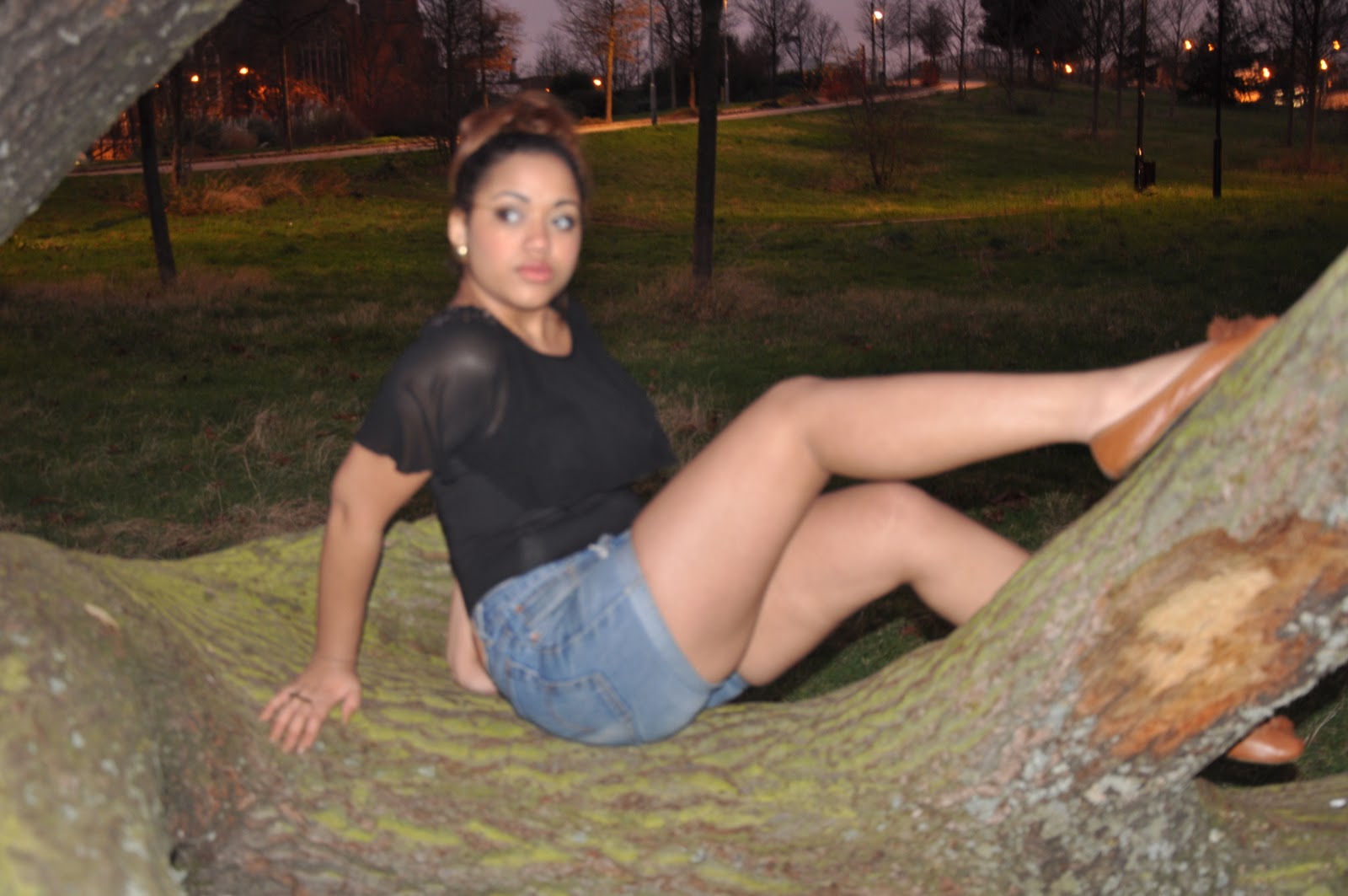
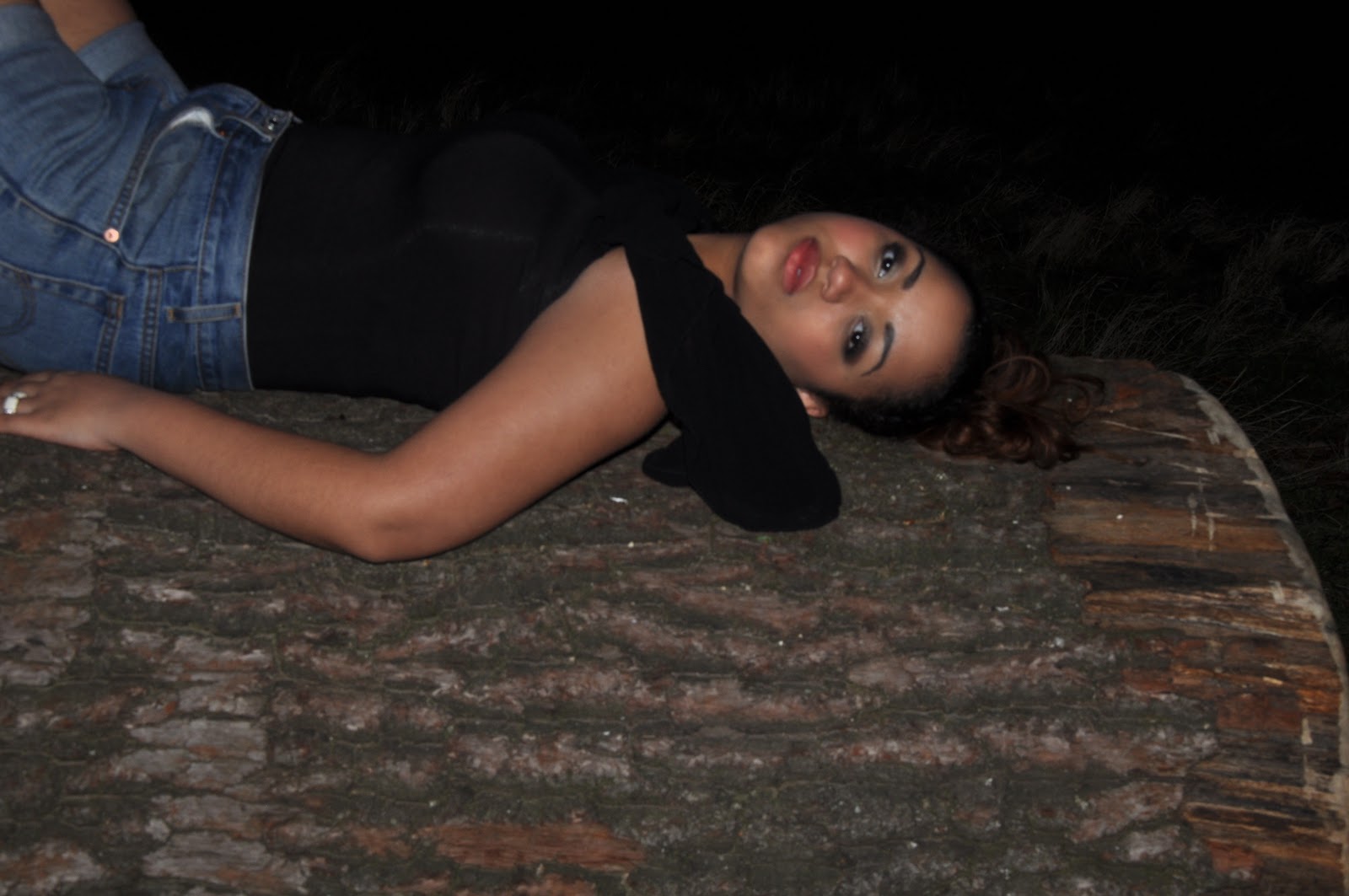
R&B music videos usually have so much iconography in their videos such as heavy gold jewellery, plenty of make-up, fancy hairstyles and also outfits that are out of the ordinary. Our video has some of these iconography elements for example our artist eye make-up is a very dark and gloomy black with a gold underline which isn’t very surprising because the color ‘gold’ is a very well- known color that is usually associated in R&B music videos. Our music video has a range of close-up shots  on the artist as Andre Goodwin theory explained that every music video should have. When it comes to R&B music videos close-up shots are really important, because in this type of genre its all about the artist and the ‘perfect image’. This is the main reason why we decided to have close-up shots on our artist because we wanted to audience to realize  that the story is about her and that she is the main focus.
In our video there is a clear intertextual reference to the childhood tale Little Red Riding Hood. Little Red Riding hood is a very well known tale and therefore the fact that we have decided to add the red cape which is the key element in this fairytale, this should gain our video some recognition with the audience. By this I mean that when previewing our music video for the first time and seeing the red cape the audience should have an idea that our video is a reference to the fairytale Little Red Riding Hood. Also the fact that our artist is wearing a red cape is a clear indication that someone is following her, just like in the fairytale ‘the wolf’ is following Little Red Riding hood. This shows that our video has some sort of voyerism because she is being watched and we portray this through the type editing we included in the video which is called ‘lightrays’; this gives the effect of someone being watched by something that is monster like. Following on from this, the fact that someone is following her shows that our video has some kind of spook to it which is very unusal for an R&B music video because usually they wouldn’t have the theme of horror/thriller in the music videos, this would be leaning towards the Rock genre. Although our music video is categorized under the R&B genre because of its slow/high tempo, it also breaks the R&B conventions of slow and sexual songs. The fact that the music video setting is mainly in a forest for a start indicates that it could potentially have another genre within it because usually R&B videos are either in a house, on a street or in a club, so therefore having a forest as a setting is breaking the conventions completely. I can therefore say that our music video transcends genres and isn’t as straightforward as other music videos, which would be safe to say that it’s unique.
Towards the end of the video we see a gold balloon, this is an unsual prop for a music video but is very typical for an R&B  media product because they usually have random things in the videos, the reason being is that it just makes the video more interesting for example in Rihannah recent music video ‘ you’re the one’ we see some star iconongraphy as  she is holding a black stick, this prop isn’t essential to the video and the lyrics but it gives her fans something to think about and talk about. However this isn’t why we choose to incorporate the gold balloon, to some extent the balloon in our music product has a meaning to it which is freedom; she’s trapped in this forest with nowhere to go. She then comes across this balloon which symbolizes hope and maybe is an indication that she’s going to find her way out soon. Even tough our artist make-up in our media product is similar to real media artist make-up in real media music videos,  the outfit is completely the opposite. In the video she’s wearing jean shorts which is classic for genre type our video is categorized in but she is also wearing thick grey tights with wellington boots which isn’t very typical along with the white top she’s wearing which implies purity.  In the case of real media products such as R&B videos this would be a completely different story as the young women in the videos would usually be wearing tight revealing clothing in order to promote their music or someone elses, however we have decided to do the complete opposite in our video and show less skin. The lighting in our video is bright and clear which is usually what R&B videos are like. When the lighting is bright its allows the audience to focus on the artist more and also it compliments the artist face when included with close-up shots, which is why we choose to film in the day light and not when it was dark.
Touching  on the subject of close-up shots again our music video has many of these and this is because we want the audience to focus on nothing else but the artist and also the kind of genre we have chosen has many close-up shots on the artist this shows the intensity and the artist facial expression, this would be a shared view of John Stewart who says that lots of close-ups and lighting should be used to focus on the stars face. For example when our artist says the word ‘stranger’ we ensured that there was a close-up shot at this point so that the word could be emphasized. We also have low angle shots of our artist feet running this shot is significant in so many ways because it shows that she is being chased and is scared just like Little Red Riding Hood was when she was in the woods all alone. R&B media products are usually based on the artist themselves , the camera is always on them and no one else therefore this is the reason why the camera hardly comes off our artist. At the beginning of the video we see her walking towards the camera this is a distinctive camerawork for our chosen genre, I say this because in real R&B it’s all about the artist body, for example in Beyonce music videos she has plenty of long shots and this is to show her dance moves which is why we did exactly the same but instead our artist makes a connect with the camera by moving towards it.
Our media product has a variety of different editing, we incoprated video transitions, stop motions, light rays etc. Without theses things the video wouldn’t really follow the Chosen genre of R&B, in today’s music industry. The reason I say this is because back in the days there wasn’t musch editing in R&B music video, as they told more of a story. For example one of Maria Carey songs from a long time ago ’heartbreaker’ doesn’t have much editing but more of a general ‘boy cheats on girl storyline’. However in her recent videos such as ‘obsessed with me’ it has more editing and less of a storyline. Even though in our video we have a storyline it isn’t so straightforward and doesn’t really follow Todorov theory, because at the beginning something or someone is following her which isn’t a happy equilibrium and at the end just when she thinks she’s free we see that someone chases her and she become shocked which therefore means there is no new equilibrium because we don’t get to find out who was following her and whether or not it made he happy which means the video ended in a cliff hanger.  Also as Erick Davis argued in order to market an artist and the song there must be some repeatability and also it must be suggestive rather than realistic. Personally I believe our video is suggestive rather than realistic because it isn’t  an easy video to understand, its quite a challenge and would require the audience to view it a couple times in order for them to completely understand the concept. Again this is typical for R&B music video because most of the time they are not based on realistic things and would take a couple viewing for someone to truly understand the meaning behind it. The fact that it isn’t easy to understand is down to the fact that it is in non-liner order and doesn’t really have a beginning to end storyline. This is why we added so many editing, the editing of our video tells the story, for example in the middle of the music video we see a point of view shot of someone looking for her, this scene has an effect called light ray which makes the clip look blurry, we then speed this up to give the impression that whoever or whatever is following her is angry and desperatly needs to find her. Without this type of editing it would not be obvious that someone who is angry is looking for her.
To conclude our music video follows and breaks the conventions of a real media products. At times it compliments our chosen genre for example when it comes to editing and storyline but in the case of costumes it breaks it in so many levels.  One theoriest that our music video would have ups and downs with would be Andrew Goodwin but John Stwart and Erika Davis theory compliment our music video.

Thursday 2 February 2012

Question 2- 1st Draft of evaluation

‘How effective is the combination of your main product and ancillary texts'?

There are some difference with my main product and my ancillary text; however there are also some similarities between the both. The location of my media product is in a forest and this is the same place I decided to do my photo shot for my ancillary text. The reason begin is that I wanted my digipak to have the same effective background that my media product did and also majority of the artist songs are very unusual and different.
In our main product our artist wore a white top which symbolised purity however when arranging my photo shoot I requested for my artist to wear a black top because I wanted her to look mature and older and I also wanted to show another side to my artist which is down to earth. However although I changed the top the main thing I made sure I kept was jean shorts. I decided to keep this item because in my main product the short are shown often so I wanted this pair of clothing to become part of my artist iconography. For example over the last couple months Beyonce has been seen wearing leotards in many of her music videos, the fact that she has persisted to wear it often has now become part of her star image and this is exactly why I wanted to keep the jean shorts.
The way in which I represented my artist make-up and hair in my ancillary text compared to my main product is completely different. In my main product her hair is down and has a messy look to it to show distress however in my ancillary text my artist look well put together because her it up in a bun although it’s a little bit messy it shows that she is versatile. Her make-up in the main product is very heavy the fiery red lipstick and the dark black and gold eye shadow imply that she is outgoing and isn’t afraid of looking ‘over the top’. This however is not the same case for my ancillary text; when taking the photo shoot I made sure that she went for the natural look  with natural colours such as nude and light browns because I wanted there to be a difference between the artist in the video and the artist on the digipak. 
The front cover of my ancillary text is a close-up shot of my artist face. Personally I believe that it is important to put the picture on the front cover because then the audience can recognise her from her video. Also this picture shows a completely different side to my artist because in the picture she looks calm and quite whereas in my main product we can see a bit of feistiness in her character as she singing. My magazine advert has a long shot of my artist sitting in a fail position with a smirk on her face again she looks peaceful  almost as if she’s in her own world which is strange because of the fact that she’s in the middle of a forest. The colours in my main product are cold and icy which could reflect on my artist personality however in my man ancillary text I colour of the picture is a warm and humid orange just like the sun which could also imply that my artist is a lovely person.

Wednesday 1 February 2012

Question 1-1st Draft

In what ways does your media product use, develop or challenge forms of conventions of a real media product?
Andrew Goodwin argued that a key aspect that makes music videos is the relationship between the lyrics and visuals. In our video the lyrics are very vague and unclear which therefore means that it was difficult to link the visual in our video with the lyric of the real artist song which therefore indicates that we haven’t followed Andrew Goodwin’s theory. This isn’t very surprising as our music video genre is R&B and majority of R&B videos have no link with the lyric and visual. The beat of the music goes accordingly with our music video; this is because the artist moves with the music, and all the shots are in time with the beat.
 R&B music videos usually have a lot going on in their video such as heavy jewellery, make-up hair and the outfits are out of the ordinary. Our music video has some of these elements for example the artist eye make-up is a very dark and gloomy black with a gold underline which ironically the colour’ gold’ is associated with R&B music videos for example Beyonce videos. The video has a variety of close-up shots on the artist as Andrew Goodwin theory explained a music video has to have. Using close-up shots is an important aspect for R&B music video because it’s all about the artist and the ‘perfect image’ this is what we used these shots throughout the video.
 In our video there is a clear intertextual reference to the childhood film ‘little red riding hood’. The red cape is the key element to this story and this is exactly what we have our artist wearing in our music video. R&B music videos typically have some sort of intertextual reference such as the brand new phone out. By our artist wearing the red cape it is a clear indication that someone is following her just like in this fairytale ‘the wolf’ is following little red riding hood. This shows that our video has some sort of voyeurism because she’s being watched and we portray this through the type of editing we included in the video which is called ‘lightrays’ this gives the effect of someone being watched. Following on from this, the fact that someone following her shows that our video has some kind of spook to it which is unusual in and R&B video because usually they wouldn’t have the theme of horror/thriller in the videos, this would lean toward the Rock genre. Although our music video is categorised under the R&B genre because of its slow/high tempo, it also breaks the R&B convention of slow and sexual songs. The fact that the music video  setting is mainly in a forest indicates that it could potentially have another Genre within it because usually R&B video are either in a house, street or club so having a forest as a setting is breaking the conventions completely. Therefore our music    video transcends genres and isn’t as straightforward as other music videos.
Towards the end of our video we see a Gold balloon this kind of prop is very typical for an R&B media products because they usually have random things in the video, the reason being is that it just makes the video more interesting for example in Rihanna music video ‘you’re the one’ she is holding a black stick, this prop isn’t essential to the video but it gives her fan someone to think about. This is why we choose to incorporate the gold balloon however to some extent the balloon in our media product has a meaning which is freedom; she’s trapped in this forest with nowhere to go and no one to see then she comes across this balloon which symbolises hope and maybe is an indication that she’s going to find her way out soon. Even though our artist make-up in our media product is similar to real artist make-up the outfit is completely the opposite. In the video she’s wearing jean shorts which is classic in a real R&B media Product, she’s also wearing thick grey tights with wellington which isn’t very typical also the white top is very neutral and implies purity. In the case of real media products such and R&B videos this would be a completely different story as women would be wearing tight, leather revealing clothing in order to promote their music however we have decided to do the completely opposite and show less skin. The lighting of our video is bright and clear which is usually what R&B videos are like. When the lighting is bright is allows the audience to focus on the artist more, which is why we choose to flim in the day light.
Touching on the subject of close-up shots again, our video has many of these and this is because we want the audience to focus on the artist and nothing else, also the kind of genre we have chosen has many close- up shots on their artist to show intensity and facial expressions. For example when our artist says the word ‘stranger’ we ensured that there was close- up shots at this point so that the word cloud be emphasised. We also have low angle shots of our artist feet running this shot is significant  in so many ways because it shows that she is being chased and is scared just like red riding hood was when she was in the wood. R&B media product is usually based on the artist themselves; the camera is always on them and no one else so this is the reason why the camera hardly ever comes off our artist. At the beginning of the video we see her walking towards the camera this is a distinctive camerawork for the genre we have chosen, I say this because in real R&B media products it’s all about the artist body, for example in Beyonce music videos she has plenty of long shots and this is to show movement which is why we did exactly the same but instead our artist is moving towards the camera.
Our Media product has a variety of different editing, we incorporated video transitions, stop motions, light rays etc. Without these things the video wouldn’t really follow the genre of R&B in today music video industry. The reason I say this is because back in the days there wasn’t much editing in R&B Video, for example the Maria Carey song  ‘heartbreaker’ doesn’t have much editing but more of a general storyline. However saying this recently her videos such as ‘obsessed with me’ have more editing and less of a storyline. Even though we do have a storyline it isn’t so straightforward and doesn’t really follow Todorov theory, because at the beginning something or someone is following her which isn’t a happy equilibrium and at the end the just when she thinks she’s free we see that someone chases her and she becomes shocked which therefore means there is no new equilibrium because we don’t get to find out what it was following her and whether or not it made her happy or not which mean that the video ends in a cliff hanger. This is the reason why we added many editing because our video doesn’t really have a storyline and means that it is in non-liner order. The editing of our video tells the story for example in the middle of the music video we see a point of view shot of someone looking for her , this scene has an effect called light rays which makes the clip look gloomy we then speed this up to give the impression that whoever is following her is very angry.


Thursday 19 January 2012

Comparison of adverts

         This is my first draft of my advert, as you can see it isn't complete and isn't very descriptive. I plan on making changes to it, this may not be major changes but there will be a difference between this on and the final advert.

This is my final magazine advert. There are some difference between this and my first draft, for instance the name of the artist is now at the top left hand conner as promised in my previous post. Also i have added a few more company logos in order to get a professional look, the front cover of my CD is no longer at the bottom but at the top of the right hand conner, the reason being is so it can be more visible since this is the main reason i am creating an advert.

Wednesday 18 January 2012

Final magazine advert

This is my final magazine advert.

1ST draft of CD advert


This is the first draft of my magazine advert, as you can see it isn't finished  however this is an idea I have. In order to finish my advert i am going to be putting the front of my CD at the top right hand conner, this is because it is a way to advertise my CD which is the aim of the magazine advert and also to make it visible to the audience. Also I will write the name of my artist at the top left and conner and add a few more company logos at the bottom.

Photoshop skills- edited version of yolanda

 Image:1

This is the original image I took of my artist when I conducted my photo shoot in mile end park. As you can see this image appears to be drained and life-less.
Image:2
As you can see the picture has changed dramatically. Firstly the image has rotated, I done this because I wanted to leave enough space to add text because this image is for my magzine advert. Secondly the colour of the picture has changed from dull to bright also the background is blurred which gives the main focus to the artist.

Tuesday 17 January 2012

Plan of CD advert

This is the plan of magazine advert. I will be following this plan to make my actual production.

Sunday 15 January 2012

Post Production: Additional research

 I have come to realize that most R&B/ Pop CD front  covers have the artist image as the front cover I believe this is because the R&B genre itself always focuses on the artist.

Another thing that i have  realized is the font of most R&B covers. The font must be easy to read and understand; Beyonce for example used a simple font which is strong and understandable this goes for most R&B covers.

Front Cover of CD Draft

This is the front cover of my Digi pack, the reason why my artist face is on the front cover is that in most R&B CD covers the artist face is on the front cover because when it comes to R&B videos its all about the artist and no one else. Since this was my chosen genre i decided to follow the conventions of music videos. 

Final digipak


In order to my may Digi pack look better I changed the CD itself by changing the name and adding company logos and term of conditions as promised in my previous post.

Friday 13 January 2012

1ST draft of digipak

This is the first draft of my Digi pack. I shall be making changes such as my CD will have my artist name written on it instead of 'LIBERTY' and this is because my artist is the main selling point. Also i am going yo add a fe company logos on the CD and terms of conditions to give it 'the professional' look.

Digipak Plan

This is the plan of my music video I shall be following this template to help me withe production of my actual music video.

Thursday 12 January 2012

Photoshoot for Digi pack and advert

In order to create my own advert and Digi pack I went to Mile End park and organised a photo shoot of Yolanda. I used the SLR Cannon camera. As you can see some pictures came out more clearer than others however I managed to get some good shots that I was able to use.